Contact Us
© 2025 Living Spaces Interiors. All rights reserved.
Maitidevi, Kathmandu
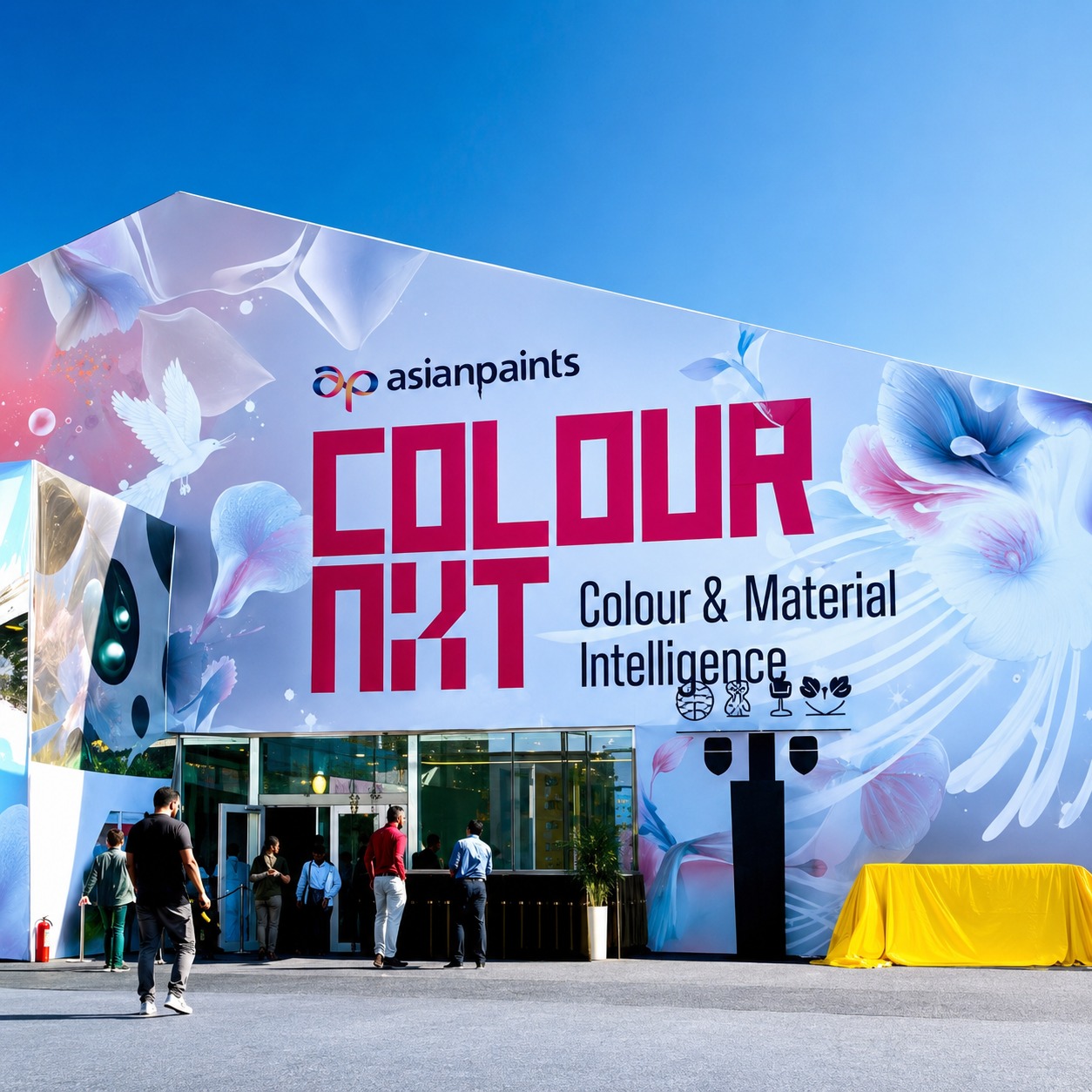
Asian Paints Color Next Campaign 2023
Asian Paints Colour Next Campaign 2023
In 2023, Living Spaces Interiors was selected as a design partner for Asian Paints' prestigious Colour Next 2023 campaign — one of India and South Asia's most anticipated annual colour forecasting initiatives. The campaign translates global colour and lifestyle trends into tangible interior environments, and Living Spaces was commissioned to bring the forecast to life across a series of curated residential showcase spaces in Kathmandu.
This collaboration placed Living Spaces at the intersection of colour science, interior design, and brand storytelling — creating spaces that demonstrated how the Colour Next 2023 palette could transform real homes.
About the Colour Next Campaign
Asian Paints Colour Next is an annual trend forecast that identifies the colours, materials, and moods set to define interiors in the coming year. The 2023 edition, themed around the idea of rootedness and quiet optimism, introduced palettes drawn from nature, memory, and craft — a counterpoint to the digital saturation of contemporary life.
Selected design studios across South Asia were invited to interpret and execute these palettes within real interior spaces, photographed for Asian Paints' national campaign materials, digital platforms, and retail showroom displays.
Living Spaces' Role
| Area of Involvement | Details |
|---|---|
| Space Selection | Three residential spaces across Kathmandu Valley — a family apartment in Lazimpat, a villa living room in Budhanilkantha, and a studio flat in Jhamsikhel |
| Palette Application | Interpretation and application of four Colour Next 2023 palettes across walls, soft furnishings, and accent finishes |
| Styling & Curation | Full furniture arrangement, décor sourcing, textile selection, and plant styling for campaign photography |
| Material Coordination | Coordination of Asian Paints finishes including Royale, Royale Glitz, and Royale Aspira in campaign-specified colours |
| Campaign Output | Styled spaces featured in Asian Paints Nepal's 2023 marketing materials, social media content, and dealer showroom displays |
The 2023 Palettes We Worked With
Living Spaces interpreted four of the five Colour Next 2023 trend palettes across the showcase spaces. Each palette carried its own emotional language, and our role was to ground those colours in liveable, aspirational interiors that felt genuinely at home in Kathmandu.
| Palette Name | Anchor Colours | Mood | Space Applied |
|---|---|---|---|
| Terrene | Warm ochre, raw clay, dusty sand | Grounded, earthy, meditative | Budhanilkantha villa living room |
| Quiet Bloom | Sage green, blush, aged linen | Soft, nurturing, organic | Lazimpat apartment — master bedroom |
| Indigo Dusk | Deep indigo, warm grey, brass | Sophisticated, contemplative, layered | Lazimpat apartment — living room |
| Chalk & Carbon | Off-white, charcoal, natural oak | Minimal, precise, architectural | Jhamsikhel studio flat |
Design Approach
Our brief was not simply to paint walls and style a room — it was to demonstrate how colour functions as architecture. Each space was designed to show the transformative potential of the Colour Next palette when applied with intention across all surfaces, materials, and layers.
Wall as Anchor, Not Backdrop
In each space, the primary wall colour was treated as the spatial anchor — the element that set the emotional register of the entire room. Furniture, textiles, and objects were selected to either harmonise with or provide deliberate contrast against it.
Texture as Colour
The 2023 campaign emphasised texture as an extension of colour perception. We layered matte and satin finishes on adjacent walls, introduced woven textiles, raw ceramics, and aged wood to show how surface quality changes how a colour is read by the eye.
Light Calibration
Each space was lit specifically for both natural and artificial conditions — a critical consideration in Kathmandu, where north-facing rooms and courtyard apartment layouts create particularly complex lighting environments. The Colour Next palettes were verified under both conditions before sign-off.
Project Specifications
| Detail | Specification |
|---|---|
| Client | Asian Paints Nepal (campaign partner) |
| Campaign | Colour Next 2023 — South Asia Regional |
| Location | Kathmandu Valley — Lazimpat, Budhanilkantha, Jhamsikhel |
| Spaces Designed | 3 residential interiors across 4 palette executions |
| Paint Products Used | Asian Paints Royale, Royale Glitz, Royale Aspira |
| Timeline | 6 weeks — concept to campaign shoot |
| Purpose | Campaign photography, brand content, dealer display reference |
| Sector | Brand Collaboration / Residential Showcase |
Outcomes
The spaces designed by Living Spaces were selected for inclusion in Asian Paints Nepal's primary 2023 campaign materials. The Terrene and Indigo Dusk executions were additionally featured in Asian Paints' regional digital lookbook distributed across Nepal, India, and Sri Lanka.
Beyond the campaign, the project demonstrated Living Spaces' ability to work within exacting brand specifications while maintaining design authorship — a balance that defines the most successful brand-designer collaborations in the industry.
The collaboration affirmed what we have always believed — that colour, applied with knowledge and intention, is the single most transformative tool available to an interior designer.
Frequently Asked Questions
How did Living Spaces come to be part of the Colour Next campaign?
Asian Paints approached a curated shortlist of design studios in Nepal with demonstrated expertise in residential interior design and colour application. Living Spaces was selected based on our portfolio, our understanding of Kathmandu's unique spatial and lighting conditions, and our track record of delivering finished spaces to a professional photography standard.
Were the spaces real client homes?
Two of the three spaces were existing client homes whose owners agreed to participate in the campaign. The third — the Jhamsikhel studio — was a vacant flat prepared specifically for the shoot. All spaces were restored to their original condition or agreed final state after the campaign photography was complete.
Can Living Spaces replicate these palettes for my home?
Yes. We are authorised Asian Paints design partners and can specify any Colour Next palette — or any Asian Paints colour — for your residential or commercial project. We provide full colour consultation, finish selection, and application supervision as part of our interior design service.
The Design Strategy
Case Study
The Asian Paints Colour Next 2023 campaign presented Living Spaces with an unusual brief — design for an audience you will never meet. Unlike a client commission where we design around one family's life, this project required us to create spaces that would speak to thousands of homeowners across South Asia, each imagining their own version of the finished room.
What follows is a transparent account of how we approached that challenge — the decisions we made, the constraints we worked within, and what we learned.
Client Profile
| Detail | Description |
|---|---|
| Client | Asian Paints Nepal — Marketing & Brand Division |
| Brief Type | Brand campaign execution — colour showcase and aspirational lifestyle content |
| End Audience | Upper-middle-class homeowners in Nepal, aged 28–55, planning renovation or new home fit-out |
| Key Expectation | Spaces that feel lived-in and aspirational simultaneously — not showroom-sterile, not overly personal |
| Deliverable | Campaign-ready styled spaces for professional photography within a 6-week window |
| Budget Position | Fixed campaign budget — all design and styling decisions made within pre-agreed spend |
The Design Challenge
Standard interior design begins with listening to a client. This project had no single client to listen to — it had a palette, a mood board, and a target demographic. Our design challenge was threefold.
First, we had to translate abstract colour trend language — words like "terrene", "quiet bloom", and "indigo dusk" — into spatial decisions that a homeowner in Kathmandu could look at and immediately understand.
Second, we had to make the spaces feel genuinely habitable. Campaign interiors often fail because they look designed rather than lived in. Asian Paints specifically wanted spaces that felt like real homes — aspirational but not alien.
Third, we were working across three different properties with three different architectural characters, lighting conditions, and spatial proportions — while maintaining visual consistency across the campaign.
Our Methodology
| Phase | What We Did | Duration |
|---|---|---|
| Palette Immersion | Deep study of the Colour Next 2023 trend report — understanding not just the colours but the cultural references, material affinities, and lifestyle contexts behind each palette | 3 days |
| Space Audit | Site visits to all three properties to assess natural light patterns, architectural proportions, wall conditions, and existing fixed elements that would interact with the palette | 2 days |
| Palette Matching | Matching each Colour Next palette to the most sympathetic space — based on light quality, room proportion, and the emotional register each space naturally suggested | 2 days |
| Concept Development | Mood boards, furniture plans, textile direction, and material specifications for each space — submitted to Asian Paints for approval before execution began | 5 days |
| Procurement & Sourcing | Sourcing all furniture, soft furnishings, ceramics, plants, and accessories within the campaign budget — prioritising local makers and existing inventory where possible | 10 days |
| Paint Application | Coordinating Asian Paints' application team for all wall and ceiling finishes — verifying colour accuracy under both natural and artificial light before sign-off | 6 days |
| Styling & Shoot Prep | Full styling of each space — furniture placement, layering of textiles, plant placement, object curation — followed by walk-through with the campaign photographer to align on angles and hero shots | 4 days |
| Photography & Wrap | 2-day campaign shoot across all three locations, followed by space restoration and client handover | 3 days |
Key Design Decisions
Matching Palette to Architecture, Not the Other Way Around
Our first significant decision was to resist the temptation to assign palettes sequentially. Instead, we spent two days in the spaces before making any colour commitments. The Budhanilkantha villa had high ceilings, terracotta floor tiles, and warm north light — it demanded the Terrene palette. The Lazimpat apartment had lower ceilings, cooler south-facing light, and a more urban character — Indigo Dusk suited its bones. Matching palette to architectural personality rather than campaign convenience was the single most important call we made.
Deliberate Imperfection in Styling
Every space was styled with what we call deliberate imperfection — a half-read book left on a side table, a throw draped casually rather than folded precisely, a ceramic bowl with visible handcraft marks. These details signal habitation. They tell the viewer that someone actually lives here. In campaign photography, this is what separates spaces that inspire from spaces that intimidate.
Restraint with Accessories
We used fewer objects than our initial mood boards suggested. In colour-led campaigns, the temptation is to fill every surface — to prove the palette's versatility. We found the opposite approach more powerful. Fewer, better-chosen objects let the colour breathe. The wall becomes the statement; everything else supports it.
Results Summary
| Metric | Outcome |
|---|---|
| Spaces Delivered | 3 residential spaces across 4 palette executions — on time and within budget |
| Campaign Inclusion | All four Living Spaces executions selected for Asian Paints Nepal's primary 2023 campaign materials |
| Regional Feature | Terrene and Indigo Dusk spaces featured in Asian Paints' South Asia regional digital lookbook — Nepal, India, Sri Lanka distribution |
| Dealer Display | Large-format prints from the Lazimpat and Budhanilkantha shoots installed in 12 Asian Paints dealer showrooms across Kathmandu Valley |
| Client Feedback | Asian Paints Nepal cited the Living Spaces collaboration as producing the strongest spatial executions in the Nepal leg of the campaign |
| Post-Campaign Enquiries | 6 direct project enquiries received from homeowners who saw the campaign spaces and contacted Living Spaces for their own home design |
What This Project Taught Us
Working within Asian Paints' campaign framework — with fixed palettes, fixed timelines, and a fixed end goal — sharpened our instincts as designers in ways that open-brief residential projects do not.
When you cannot change the colour, you learn to manipulate everything else — texture, proportion, light, and object placement — with greater precision. The constraints of the brief made us better at our craft, and that precision has carried directly into how we approach every residential project since.
The campaign also confirmed something we tell every client at the start of a project: colour is not decoration. It is the architecture of feeling. Get it right, and everything else falls into place.